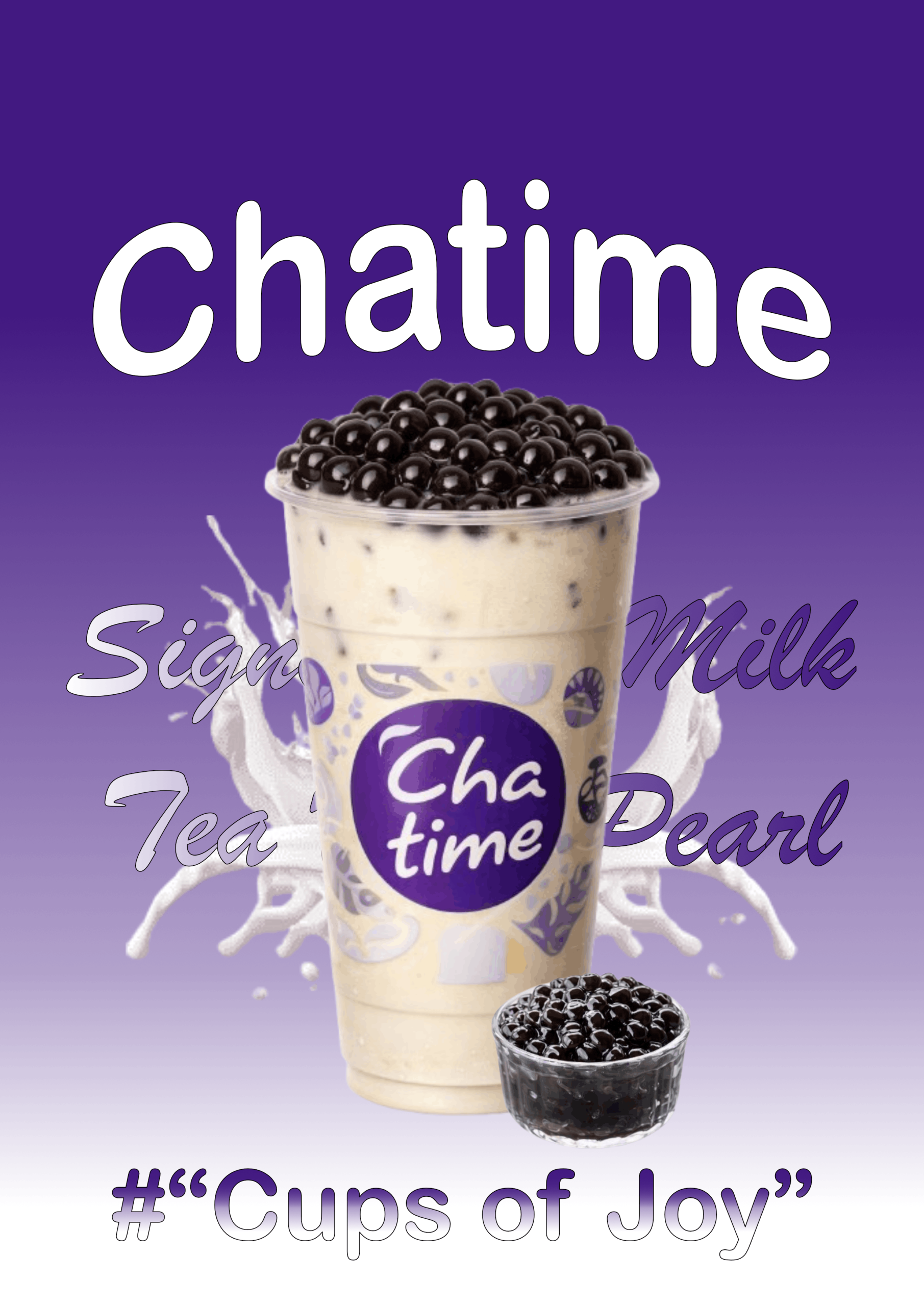
I created this poster using Affinity Designer, which provided a flexible workspace for combining images, text, and gradients. The background was built with a gradient fill tool to achieve the smooth transition from dark purple to light purple, reflecting Chatime’s signature brand colors. The main focus of the design is the large cup of milk tea with pearls, accompanied by a smaller container of tapioca pearls, both arranged to highlight the product visually.
To achieve the dynamic look, I used several tools in Affinity. The Fill Tool was applied to create the gradient background, while the Pen Tool and Shape Tool helped in adjusting layout elements and decorative splashes. The Text Tool was used to insert the Chatime logo, product name, and tagline “Cups of Joy.” Additionally, the Layer Effects panel allowed me to add subtle shadows and highlights, giving depth to the cup and pearls.
The overall impression of making this poster was very enjoyable. It felt creative and rewarding to see how simple elements like gradients, splashes, and bold typography could come together into a vibrant promotional design. The process gave me a sense of satisfaction, especially when the purple tones and milk splash effects blended harmoniously with the product image. It truly captured the lively and joyful spirit that Chatime wants to convey through its branding.